Creating Effective Spreadsheet Dashboards
Visualize your data with impactful dashboards.
Creating effective dashboards in spreadsheets is a critical skill for anyone looking to enhance their data visualization capabilities. A well-designed dashboard not only presents data clearly and concisely but also enables stakeholders to quickly grasp insights and make informed decisions. In this guide, we will explore the essential elements of dashboard creation, including design principles, data integration, and visualization techniques. By the end of this article, you will have a comprehensive understanding of how to construct impactful dashboards that communicate information effectively.
The importance of effective dashboards cannot be overstated. They serve as a focal point for data analysis, allowing users to track performance metrics, identify trends, and drive strategic initiatives.
Understanding Your Audience
Before diving into the creation of a dashboard, it is crucial to understand the audience that will be using it. Different stakeholders may have varying needs and preferences when it comes to data presentation. For instance, executives often prefer high-level summaries, while analysts may require more detailed views with granular data.
Identifying key metrics that resonate with your audience is essential. These metrics should align with the goals of the users and the objectives of the organization. For example, if the primary goal is to increase sales, metrics such as revenue growth, sales conversion rates, and customer acquisition costs should be front and center. Tailoring the dashboard to meet these specific needs not only enhances user engagement but also improves the overall effectiveness of the dashboard.
“A dashboard is only as good as the data it presents and the audience it serves.”

Once you have a clear understanding of your audience and the metrics that matter, you can begin to structure the dashboard accordingly.
Design Principles for Dashboards
The design of a dashboard plays a pivotal role in how effectively information is communicated. A clean, intuitive layout helps users navigate the data with ease. One fundamental principle is to avoid clutter—too much information can overwhelm users and obscure key insights. Instead, focus on simplicity and clarity.
Using a grid layout can help organize elements logically, allowing for easy comparisons and quick understanding. Colors also play an essential role in dashboard design. They should not only be visually appealing but also serve a functional purpose, such as highlighting critical values or differentiating between categories.
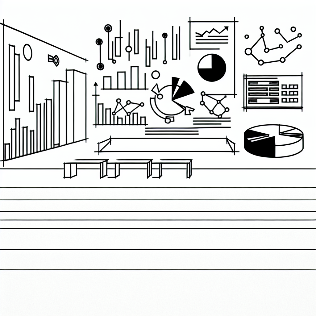
Additionally, consider the use of charts and graphs to visualize data. Visual representations often allow users to grasp trends and patterns more quickly than raw numbers. For example, a line graph can effectively depict sales trends over time, while a pie chart can illustrate market share distribution among competitors.
Data Integration Techniques
A dashboard is only as powerful as the data that feeds it. Integrating various data sources into a cohesive dashboard is a challenge that many face. Commonly, data comes from multiple systems, whether it be sales platforms, marketing tools, or financial software.
Utilizing data connectors can simplify this process significantly. Many spreadsheet tools offer built-in features or plugins that facilitate data connection to external sources. This capability allows for real-time data updating, ensuring that the information presented is always current.
Moreover, consider the importance of data accuracy. Implementing validation techniques ensures that the data being visualized is reliable, which is critical for making sound business decisions. Regular audits and checks can help maintain data integrity, preventing potential errors from affecting dashboard outputs.
Visualization Techniques
When it comes to data visualization, the right techniques can make all the difference. Depending on the type of data being presented, different visualization methods may be more effective. For example, bar charts are excellent for comparing categories, while scatter plots can highlight correlations between two variables.
Employing interactive elements can also enhance user experience. Features such as drop-down menus, sliders, and clickable segments allow users to filter data dynamically. This interactivity not only engages users but also empowers them to explore the data on their terms.

It’s also worthwhile to consider the use of storytelling within your dashboard. Presenting data in a narrative format can draw users in and help them understand the context behind the numbers. This technique can be particularly powerful in executive dashboards, where the aim is to communicate insights that drive strategic decisions.
Testing and Iteration
Creating a dashboard is not a one-off task; it requires ongoing testing and iteration. Gathering feedback from users is crucial in identifying areas for improvement. Conducting usability tests can reveal how effectively users navigate the dashboard and whether the information presented meets their needs.
Incorporating this feedback allows for continuous enhancement of the dashboard. Small adjustments can lead to significant improvements in user satisfaction and effectiveness. Regularly revisiting the dashboard to ensure it remains relevant and aligned with organizational goals is an essential practice.