Mastering Data Visualization Techniques in Spreadsheets
Transform your data into impactful visuals.
Data visualization is an essential skill in today’s data-driven world, particularly when it comes to spreadsheet applications. The ability to transform raw data into engaging and informative visuals not only enhances understanding but also aids in effective decision-making. With a few key techniques, anyone can create stunning representations of their data, making presentations more compelling and accessible. This article delves into various strategies for mastering data visualization techniques within spreadsheets, enabling professionals and educators alike to communicate insights clearly.
Effective data visualization is more than just creating pretty charts; it’s about conveying information in a way that is immediately understandable. Well-designed visuals can simplify complex data and highlight key trends or insights that might otherwise be overlooked. When executed correctly, data visualizations can significantly enhance the impact of presentations, helping audiences to grasp essential information quickly.
Understanding the Basics of Data Visualization
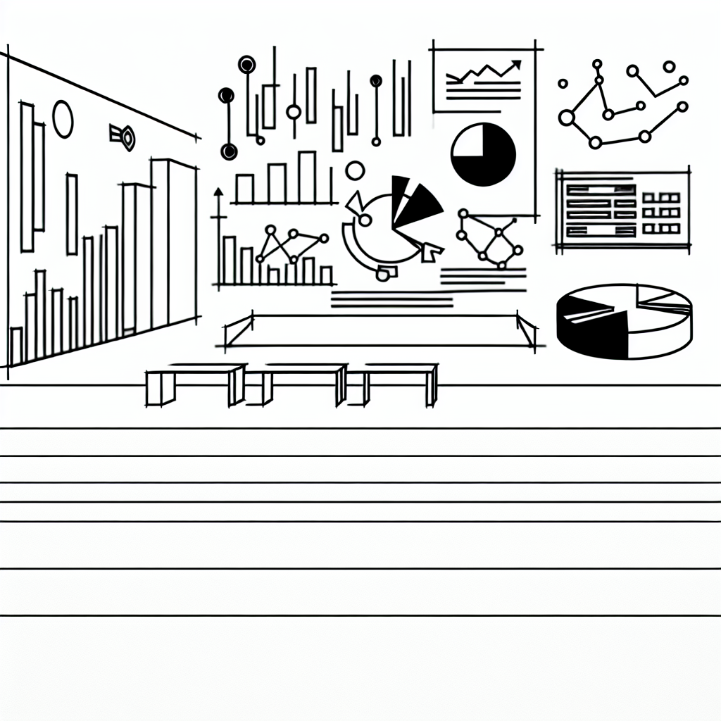
Before diving into specific techniques, it’s crucial to understand the fundamental principles of data visualization. At its core, data visualization is about representing information visually to make patterns, trends, and anomalies clearer. Common types of visualizations include bar charts, line graphs, pie charts, and scatter plots, each serving different purposes. The choice of visualization often depends on the type of data being presented and the message you wish to convey.
A good visualization starts with a clear understanding of your data. This means knowing what story you are trying to tell. As such, selecting the right chart type is fundamental. For example, if you want to compare parts of a whole, a pie chart can be effective, whereas a line graph is ideal for illustrating trends over time.
Research suggests that the right visualization can improve comprehension and retention of information by as much as 400%.
Moreover, it’s essential to consider your audience when designing visuals. Different groups may require varying levels of detail or complexity. Tailoring your approach to the audience can dramatically affect how your message is received.
Choosing the Right Visualization Techniques
Once you have a firm grasp of your data and audience, the next step is choosing the right visualization techniques. Choosing the appropriate chart type is vital in ensuring that your data is presented in the most effective manner. For instance, while line charts are excellent for tracking changes over periods, stacked bar charts can effectively display cumulative data.
In spreadsheets, functionalities like data filtering and pivot tables can enhance your ability to create meaningful visuals. These tools allow you to manipulate your data dynamically, making it easier to explore different angles or trends without manually adjusting your dataset each time.
For more complex data relationships, scatter plots can be invaluable, revealing correlations that may not be immediately obvious with other types of charts. When dealing with categorical data, bar charts often provide a clear comparison between groups, making them a staple in presentations.
Enhancing Visual Appeal with Design Principles

Design principles play a crucial role in the effectiveness of your visualizations. Effective use of colors, fonts, and layouts can significantly enhance the viewer’s experience. A well-designed chart should be aesthetically pleasing while remaining functional. For instance, using contrasting colors can help differentiate data sets, but overusing bright colors can lead to confusion.
Another aspect to consider is labeling your visuals appropriately. Each axis should be clearly marked, and legends should be easy to read. Titles should succinctly convey what the visualization represents, providing context to the viewer.
Furthermore, maintaining consistency in design elements helps create a cohesive presentation. Utilizing the same color schemes, font types, and styles across all visuals can make your presentation look professional and polished.
Utilizing Advanced Features in Spreadsheets
Modern spreadsheet applications come equipped with advanced features that can elevate your data visualization game. For example, conditional formatting allows users to apply color codes based on data values, instantly drawing attention to critical metrics. This technique can be particularly useful for highlighting outliers or performance against targets.
Additionally, tools like sparklines provide a compact visual representation of trends within a single cell, offering a quick overview without the need for extensive charts. Integrating these features can enhance the depth of your analysis and provide more insights than traditional charts alone.

Using interactive elements, such as sliders or dropdowns, can also make your visualizations more engaging. These features allow users to explore different scenarios or datasets dynamically, making the presentation more interactive and informative.
Common Pitfalls to Avoid
While data visualization can significantly enhance your presentations, there are common pitfalls to watch out for. One major mistake is overloading visuals with too much information. A cluttered chart can confuse viewers and dilute the message you wish to convey. Strive for simplicity and clarity, focusing only on the most critical data points.
Another common error is neglecting to validate your data. Inaccurate or misleading data can lead to incorrect conclusions, undermining the credibility of your entire presentation. Always ensure that your data is reliable and up-to-date before creating visual representations.
Finally, failing to practice or rehearse the presentation of your visuals can lead to miscommunication. Familiarize yourself with the content and flow of your presentation, ensuring that you can effectively guide your audience through the visuals you’ve created.