Step-by-Step Guide to Building Spreadsheet Dashboards
Visualize your data with impactful dashboards.
Creating spreadsheet dashboards can transform the way you visualize and interact with data. By consolidating information into a single, dynamic interface, dashboards allow users to glean insights quickly and effectively. This step-by-step guide will walk you through the essential components of building a dashboard that not only looks appealing but also functions seamlessly, ensuring that your data tells a compelling story.
Dashboards are more than just visuals; they are powerful tools for decision-making.
Understanding the Basics of Dashboard Design
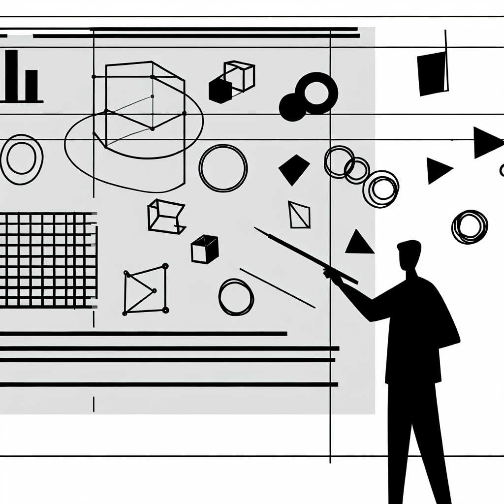
Before diving into the mechanics of creating a dashboard, it’s crucial to grasp the fundamental principles of effective dashboard design. A well-designed dashboard should present relevant information clearly and concisely, allowing users to focus on key data points. Central to this design is the idea of data prioritization—identifying which metrics matter most and displaying them prominently.
“A dashboard should tell a story, guiding the viewer through the data in a logical and engaging way.”
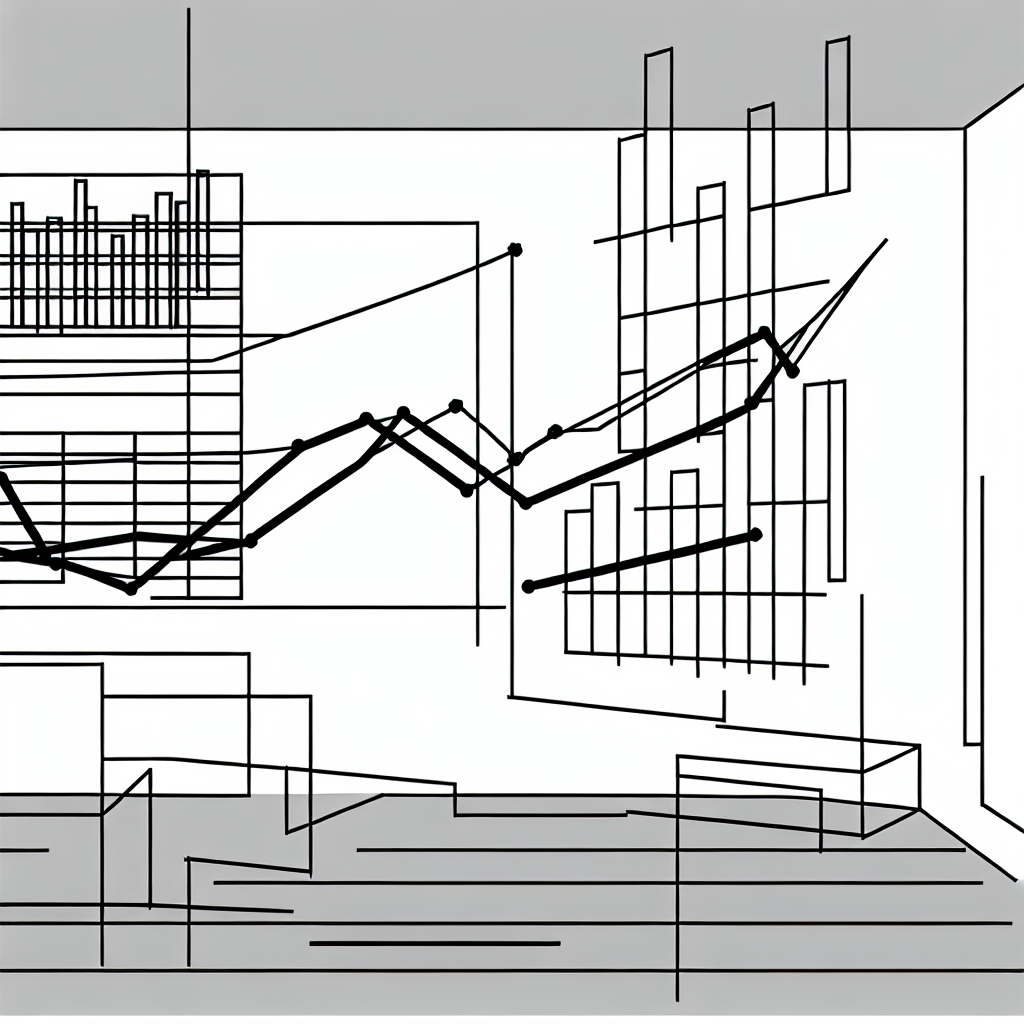
The visual elements used in dashboards, such as charts, graphs, and tables, must be chosen carefully. Each component should serve a specific purpose, helping to illustrate trends or highlight important changes. For instance, bar charts may be ideal for comparing quantities, while line graphs effectively display trends over time. Understanding these distinctions will help you select the right visuals to convey your data accurately.

As you design your dashboard, consider the audience who will interact with it. Tailoring the content to their needs ensures that your dashboard is not just informative but also engaging. By keeping your audience in mind, you can align your metrics and visuals with their interests and questions, enhancing the overall effectiveness of your dashboard.
Gathering and Organizing Your Data
The next step in building an effective spreadsheet dashboard is data collection and organization. Before you can create visual elements, you need to gather the relevant data sets. This might involve pulling data from various sources, including databases, other spreadsheets, or even manual inputs.
Once you have your data, the organization is key. Create a structured layout within your spreadsheet that allows for easy access to the data you will visualize. Group similar data points together and consider using clear labels for each section. This organization not only simplifies the visualization process but also makes it easier to update the dashboard in the future.
It can also be beneficial to perform a preliminary analysis of your data to identify any trends or anomalies. This analysis will inform your decisions regarding which metrics to highlight in your dashboard, ensuring that the most pertinent information is showcased.
Creating Visual Components
With your organized data in hand, the next phase is to create the visual components of your dashboard. Start by selecting the appropriate chart types for your data. For instance, if you’re comparing sales data across different regions, a pie chart might effectively illustrate the market share of each region, while a bar chart could be better suited for showing sales performance over several months.

The Excel or Google Sheets tools provide a range of functionalities to create these visual elements. Utilize the chart creation features, adjusting parameters such as colors, labels, and titles to enhance clarity. Remember, the goal is to make your data easily understandable at a glance, so avoid cluttering your dashboard with excessive visuals.
In addition to charts, consider incorporating conditional formatting to provide immediate visual cues about your data. For instance, using color scales to indicate performance levels can help users quickly identify areas that need attention. This kind of visual cueing enhances the dashboard’s effectiveness and supports informed decision-making.
Integrating Interactive Elements
To elevate your dashboard further, consider integrating interactive elements. Features such as drop-down menus, sliders, and checkboxes can enhance user engagement and allow for a more tailored experience. For instance, a drop-down menu might allow users to filter data by specific categories, enabling them to focus on the metrics that matter most to them.
Using tools like data validation and pivot tables can help facilitate this interactivity. These features allow users to manipulate data dynamically, leading to a more engaging and user-friendly dashboard experience.
“Interactivity in dashboards not only increases user engagement but also boosts the usability, making complex data sets accessible and manageable.”
As you build these interactive components, ensure that they function seamlessly and do not detract from the overall clarity of the dashboard. Testing the interactions before finalizing your dashboard is essential to confirm that users can navigate it intuitively.
Finalizing and Sharing Your Dashboard
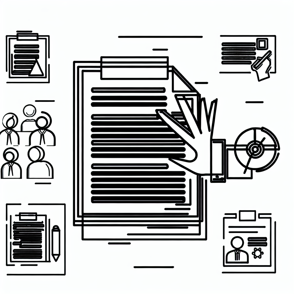
After completing the design and functionality of your dashboard, it’s time to finalize and share it with your intended audience. Review your dashboard for clarity, accuracy, and aesthetic appeal. Ensure that all visual components are functioning correctly and that the data is up-to-date.
Once you are satisfied with the final product, consider the best way to share it. For spreadsheets created in programs like Excel, you can save and distribute the file directly. Alternatively, if you are using Google Sheets, sharing options are straightforward, allowing for real-time collaboration and visibility.
As you share your dashboard, provide a brief guide or tutorial to walk users through its features, emphasizing how they can interact with the data. This will enhance their experience and ensure that they make the most of the tools you have created.
Creating a spreadsheet dashboard is a rewarding process that can significantly enhance data visualization and decision-making capabilities. By following these steps, you can build a dynamic, engaging dashboard tailored to your needs.