Step-by-Step Guide to Creating Dynamic Dashboards
Transform your data into insightful dashboards.
Creating dynamic dashboards in spreadsheets can significantly enhance your ability to visualize and analyze data. These dashboards allow users to interact with their data in real time, making insights more accessible and decisions more informed. By leveraging functions and features available in spreadsheet applications, one can transform raw data into compelling visual narratives that tell a story. This guide will walk you through the essential steps to create your own dynamic dashboards, regardless of your current level of expertise.
Dynamic dashboards not only present data but also empower users to engage with it. When done correctly, they serve as a powerful tool for businesses and individuals alike.
Understanding the Basics of Dashboards
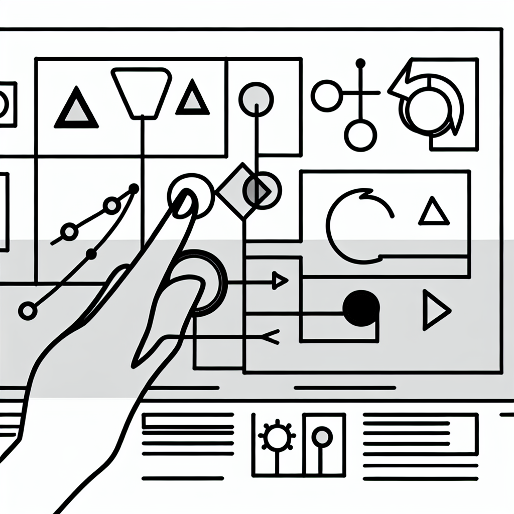
Before diving into the construction of a dynamic dashboard, it is essential to understand what a dashboard is and what makes it dynamic. A dashboard is a visual display of key metrics and data points that provide an overview of performance or status at a glance. Dashboards typically feature various visualization components such as charts, graphs, and tables that summarize complex data into easily digestible formats.
Dynamic dashboards, on the other hand, take this concept a step further by incorporating interactive elements. This interaction can include filters, drop-down menus, and slicers that allow users to manipulate the data being displayed. For instance, a sales dashboard could allow users to select specific time periods or regions, instantly updating the visualizations to reflect the chosen parameters.

A dynamic dashboard is a powerful tool that turns static data into a living, interactive experience.
In creating a dynamic dashboard, the first step is often to gather and prepare your data. This includes cleaning the data to ensure accuracy and consistency, as well as structuring it in a way that aligns with the dashboard’s intended use. Data preparation is crucial, as it lays the groundwork for effective visualization.
Selecting the Right Visualization Tools
Once your data is prepared, the next step involves selecting the appropriate visualization tools. Most spreadsheet applications offer a variety of chart types, including bar charts, line graphs, pie charts, and scatter plots. The choice of visualization should depend on the type of data being represented and the insights you wish to convey.
For example, if you are comparing sales figures across different categories, a bar chart may be more effective than a pie chart, which is better suited for showing proportions. Additionally, consider using conditional formatting to highlight certain values or trends. This can draw attention to critical data points, enhancing the overall impact of your dashboard.
Creating an interactive experience can greatly enhance user engagement. Adding features such as dropdown menus or checkboxes allows users to filter data dynamically. For instance, incorporating a dropdown menu for selecting different product lines can help users visualize sales trends across various categories without cluttering the dashboard with multiple charts.
Building Your Dashboard Step-by-Step
As you embark on building your dashboard, follow these steps to ensure a systematic approach. Start by laying out a clear design. A well-structured dashboard should be visually appealing and easy to navigate. Consider using grid layouts to position your charts and tables logically.
Begin with a title and brief description at the top to provide context for the dashboard. Next, arrange your primary visualizations in a way that highlights the most critical metrics first. Place less vital information toward the bottom or on subsequent pages if your dashboard spans multiple sheets.
Once you have the layout, it’s time to input your visualizations. Use the chart tools available in your spreadsheet application to create the visual elements based on your prepared data. Ensure that each visualization is clearly labeled with titles and units of measurement where applicable.
Consistent labeling and unit representation are crucial for clarity and understanding in a dashboard.
Finally, test the interactivity of your dashboard. Ensure that all filters and dropdowns function correctly and that the data refreshes as expected. This testing phase is vital, as it will confirm that the dashboard operates as intended and provides accurate insights.

Final Touches and Sharing Your Dashboard
With the dashboard constructed and tested, it’s time to add the finishing touches. This might include adjusting color schemes for better visibility, ensuring that text is legible, and even including tooltips for additional information when users hover over certain elements. A polished dashboard not only looks professional but also improves user experience.
Once satisfied with your design, consider the sharing options available. Many spreadsheet applications allow you to share dashboards easily, whether it’s through direct links, email, or embedding in other applications. Ensure that any shared dashboards maintain the necessary security settings, especially if they contain sensitive information.
Engaging with your audience after sharing the dashboard can provide valuable feedback. Encourage users to ask questions or suggest improvements; this can lead to further refinements and enhancements in future iterations of your dashboard.