Creating Interactive Dashboards in Spreadsheets
Transform your data into actionable insights.
In today’s data-driven environment, the ability to transform raw data into actionable insights is crucial for businesses and individuals alike. Interactive dashboards are powerful tools that allow users to visualize their data dynamically, facilitating better decision-making. This tutorial will guide you through the essential steps of building interactive dashboards within your spreadsheets, ensuring that your data is not only organized but also presented in a way that highlights key trends and insights.
Understanding the Components of an Interactive Dashboard
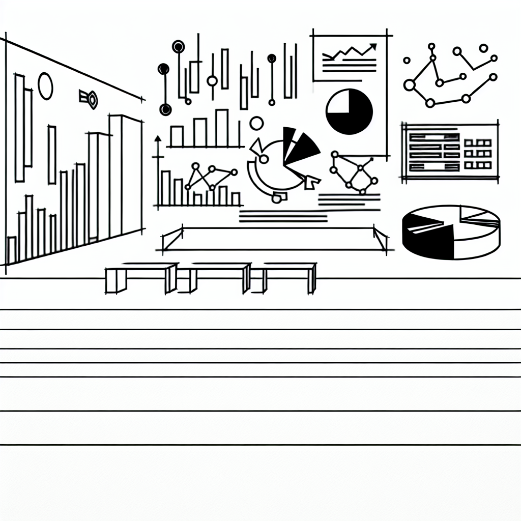
An effective interactive dashboard is more than just a collection of charts and tables; it is a thoughtful integration of various components that work together to convey information clearly and engagingly. Typically, a dashboard consists of visual elements such as charts, graphs, and tables, accompanied by filters and slicers that allow users to manipulate the data displayed. Understanding these components is the first step toward creating a dashboard that communicates effectively.
Data visualization elements, such as pie charts for categorical data or line graphs for trends over time, play a significant role in making complex information digestible. Moreover, the layout of the dashboard should be intuitive, guiding the user’s eye to the most critical information first. This often involves strategic placement of visual elements, ensuring that related data points are grouped together while maintaining a clean and uncluttered appearance.
Filters and slicers are also integral to interactive dashboards, as they provide users with the ability to explore various facets of the data. For instance, a sales dashboard might allow users to filter by region, product category, or time period, enabling them to uncover insights tailored to their specific queries. The interactivity of these components not only enhances user engagement but also fosters a deeper understanding of the data at hand.
Setting Up Your Spreadsheet
Before diving into the creation of your interactive dashboard, it is essential to prepare your spreadsheet. This preparation involves organizing your data into a well-structured format. Typically, this means ensuring that each column has a clear header and that the data is free of duplicates or errors. A clean dataset serves as the foundation for effective visualizations.
Once your data is formatted appropriately, the next step is to determine the key metrics you want to highlight on your dashboard. By defining these metrics early in the process, you can create visualizations that directly address the questions or objectives you have in mind. For instance, if you are focused on sales performance, you might choose metrics such as total sales, average order value, or sales growth rate.
Additionally, consider the target audience for your dashboard. Different stakeholders may require different views of the same data. For example, a marketing team may be more interested in campaign performance metrics, while finance may want to see revenue forecasts. Tailoring your dashboard to meet the needs of its users can significantly enhance its effectiveness.
Creating Dynamic Visualizations
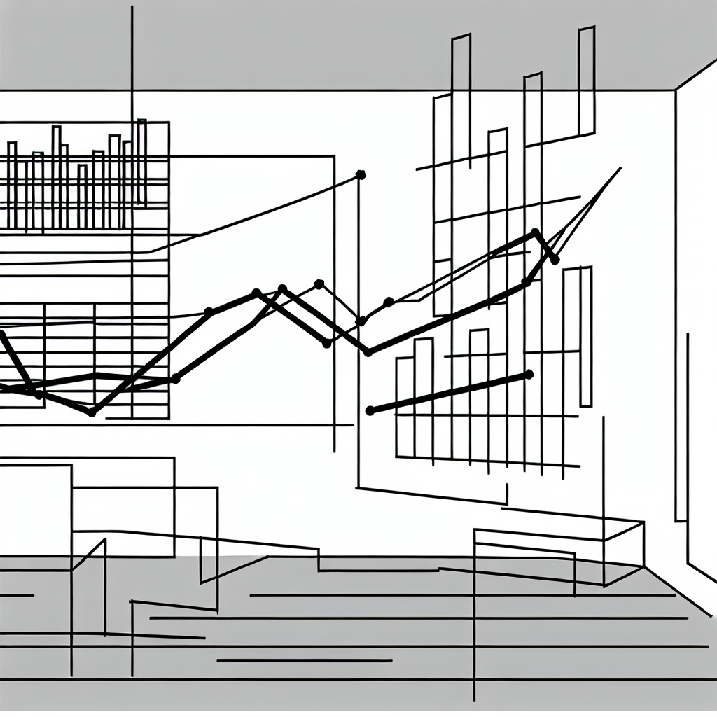
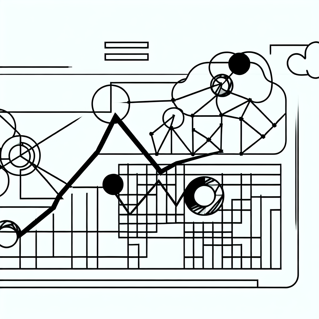
With your data set up and your key metrics defined, it is time to create the visual components of your dashboard. Most spreadsheet applications offer a variety of chart types, such as bar charts, line charts, and scatter plots, each suited for different types of data analysis. Selecting the right chart type is pivotal; for instance, bar charts are excellent for comparing categories, while line charts are ideal for showing trends over time.
To make your visualizations more dynamic, consider using features such as data validation lists, which allow users to select criteria that automatically update the charts displayed. This interactivity can significantly enhance the user experience, as it enables them to engage with the data directly. Additionally, using conditional formatting can help highlight key data points, making it easier for users to identify trends and anomalies at a glance.
Incorporating dashboards with interactive elements can also involve using pivot tables, which allow for complex data analysis without extensive manual manipulation. Pivot tables can summarize large datasets effectively and can be linked to your visualizations, ensuring that any updates to the underlying data are reflected in the dashboard automatically.
Refining Your Dashboard for Usability
Once your visualizations are in place, the next step is to refine your dashboard for usability and aesthetics. This involves reviewing the overall layout and design to ensure that it is visually appealing and easy to navigate. A well-designed dashboard should not only look professional but also guide the user intuitively through the information presented.
Consider the color schemes and fonts used in your dashboard; they should be consistent and align with the overall branding if applicable. Additionally, providing clear labels and legends for your charts and graphs is essential for helping users understand what they are viewing. Including tooltips or descriptions can further enhance clarity by offering context to the visualizations.
User feedback can be invaluable during the refinement process. Engaging potential users and soliciting their input on the dashboard’s layout, functionality, and overall usability can provide insights that may not be apparent to the creator. This iterative process can lead to a more effective final product that meets the needs of its audience.
Testing and Iterating Your Dashboard
After refining your dashboard, it is crucial to test its functionality thoroughly. This phase involves ensuring that all interactive elements work as intended and that the data displayed is accurate and up-to-date. Testing can reveal issues such as broken links, misconfigured filters, or inaccuracies in data representation—problems that must be addressed before deployment.
Once testing is complete, consider how you will maintain and update the dashboard moving forward. Regular updates to the underlying data should be scheduled, and the dashboard should be monitored to ensure it continues to meet user needs. Feedback loops are essential; users should feel encouraged to provide suggestions for improvements as their requirements evolve.
Iterating on your dashboard based on user feedback can lead to continuous enhancements, making it a living tool that grows with your needs. By maintaining an agile approach to your dashboard, you can ensure that it remains relevant and useful over time.