New Techniques for Data Visualization in Spreadsheets
Transform your data presentation with innovative visualization methods.
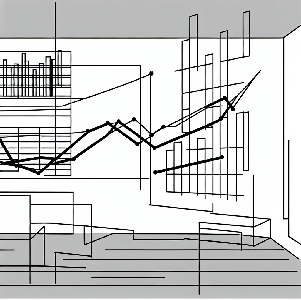
Data visualization is an essential aspect of data analysis that allows users to convey complex insights through clear and engaging graphical representations. As technology continues to evolve, so do the techniques available for visualizing data in spreadsheets. This article delves into some of the most effective and innovative methods for transforming your data presentations, making them not only more visually appealing but also easier to understand. By employing these techniques, you can enhance the clarity and effectiveness of your insights, leading to better decision-making and communication.
Visual representation of data is not just about aesthetics; it is about enhancing understanding. Effective visualization techniques can highlight trends, patterns, and outliers in your data, providing immediate insights that might otherwise be overlooked in raw numbers. As spreadsheets become increasingly integral to data analysis across various fields, mastering these visualization techniques can significantly impact how you present and interpret information.
The Importance of Data Visualization
Data visualization serves as a bridge between raw data and actionable insights. It transforms numbers and text into visual formats such as charts, graphs, and maps, making information more digestible and engaging for viewers. Research indicates that individuals are more likely to retain information presented visually compared to text-heavy formats. This is particularly relevant in business contexts, where decision-makers often rely on quick interpretations of data to guide their strategies.
Effective data visualization is not just about creating pretty pictures; it’s about telling a story with data.
Incorporating various visualization techniques can help identify correlations and trends that may not be immediately obvious. For instance, using scatter plots can elucidate relationships between variables, while bar charts can provide a clear comparison of different groups. The key is to choose the right visualization for your data type and the message you wish to convey.
Innovative Techniques for Data Visualization
One of the most exciting developments in data visualization is the integration of interactive elements into spreadsheets. Tools like dynamic charts and dashboards allow users to explore data on their own, adjusting parameters to see how changes affect outcomes. This interactivity can lead to deeper insights, as users can manipulate data in real-time and observe the results instantly.
Another innovative technique is the use of heat maps, which provide visual cues to identify the intensity of values across a dataset. By coloring cells according to their values, you can quickly spot trends, anomalies, and clusters within your data. This technique is particularly useful in large datasets, where traditional methods may fail to highlight significant insights.

Incorporating infographics into your spreadsheets is another powerful way to enhance data visualization. Infographics combine various visual elements such as icons, charts, and text to present complex information in a simplified manner. By summarizing key data points and insights in an infographic format, you can make your findings more engaging and memorable for your audience.
Best Practices for Effective Data Visualization
While innovative techniques abound, adhering to best practices in data visualization is crucial for ensuring clarity and effectiveness. Start by defining your audience and the message you want to convey. This foundational step will guide your choice of visualization type, ensuring that it aligns with the needs and comprehension levels of your viewers.
It’s also essential to maintain consistency in your visual elements. Use a uniform color palette and font style throughout your spreadsheet to create a cohesive look. This consistency not only enhances aesthetics but also improves readability and understanding. Additionally, avoid cluttering your visualizations with excessive information or decorative elements that may distract from the key insights.
Lastly, always keep accessibility in mind. Ensure that your visualizations are understandable for individuals with varying levels of data literacy. Providing clear labels, legends, and descriptions can help bridge gaps in understanding and make your insights more accessible to a broader audience.

Tools and Resources for Data Visualization
With the rise of various spreadsheet software, an array of tools is available to assist users in creating compelling data visualizations. Programs like Microsoft Excel and Google Sheets offer built-in charting tools, allowing users to create a wide range of visualizations with ease. Additionally, third-party tools such as Tableau or Power BI can integrate with spreadsheets to create more advanced visualizations.
Moreover, numerous online resources and tutorials can guide users in mastering these tools. Websites dedicated to data visualization often provide case studies, best practices, and design principles that can help enhance your skills and understanding. Engaging with these resources can provide inspiration and improve your ability to present data effectively.